Brand transform · Cheapflights
Transforming one of travel's original online brands
Cheapflights is one of the internet’s first flight comparison websites, pioneering the pay-per-click model. After almost twenty years of growth, the business had evolved into a collection of separate products, regional teams and international markets. The experience had become inconsistent, making it difficult for customers to recognise one coherent brand and the branding had become tired in an increasingly crowded space.
I led the end-to-end rebrand, working across Product, Marketing and Executive leadership to redefine the brand, rebuild the product experience and create a design system that could scale globally.
The programme culminated in the launch of new responsive websites, a new mobile app, refreshed marketing campaigns and a complete brand system used across every customer touchpoint.
Starting with customers, not colours
A new visual identity was never the objective.
We began by understanding who Cheapflights should serve over the next decade and what role the business should play in people’s travel journeys. Working with research, commercial teams and senior leadership, we defined the customers we wanted to reach, the values the business should embody and how those values should be reflected in the product experience.
Next, we established a clear framework for how Cheapflights should behave.
The work captured in the Brand Book defined the organisation’s belief, values, tone of voice and visual language. It wasn’t produced as a marketing document; it became the shared reference point for product, design and marketing teams across the business.
The framework established:
- a clear customer proposition: We make travel simpler.
- four core brand values that guided design decisions
- writing principles for every customer interaction
- a scalable visual system spanning typography, colour, iconography, illustration and photography
By agreeing these principles first, we created consistency before a single interface was redesigned.
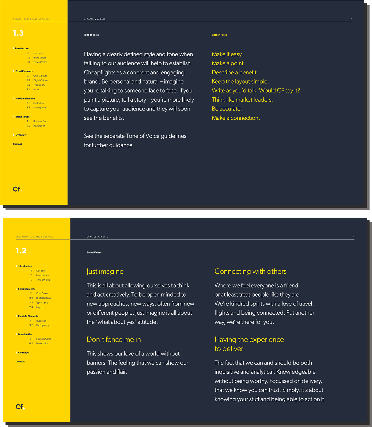
Excerpts from the Brand Book
Designing a system, not individual screens
With the strategic foundations agreed, my team created a complete design language that could work across every platform and market.
Rather than designing isolated interfaces, we built reusable assets that allowed products and marketing to evolve together.
The system included:
- responsive web patterns
- mobile UI
- logos and lock-ups
- typography
- colour system
- iconography
- illustration principles
- photography direction
- presentation templates and internal collateral
The result was a single design language that could be applied consistently whether customers were searching for flights, browsing destinations or interacting with the brand through advertising or social media.
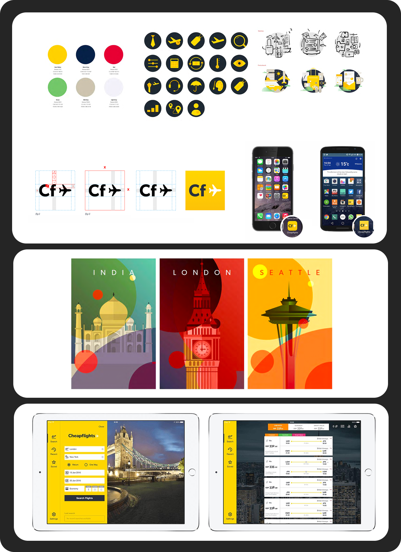
Various examples of the new brand guide and expression
Bringing the brand to life
The rebrand wasn’t confined to product.
We rebuilt fifteen international websites, launched a completely redesigned mobile application and developed a library of campaign artwork that could scale globally while remaining recognisably Cheapflights.
Because the product and brand were developed together, customers experienced one coherent journey regardless of where they entered the ecosystem.
This even extended to TV where I applied art direction to our high-budget ad.
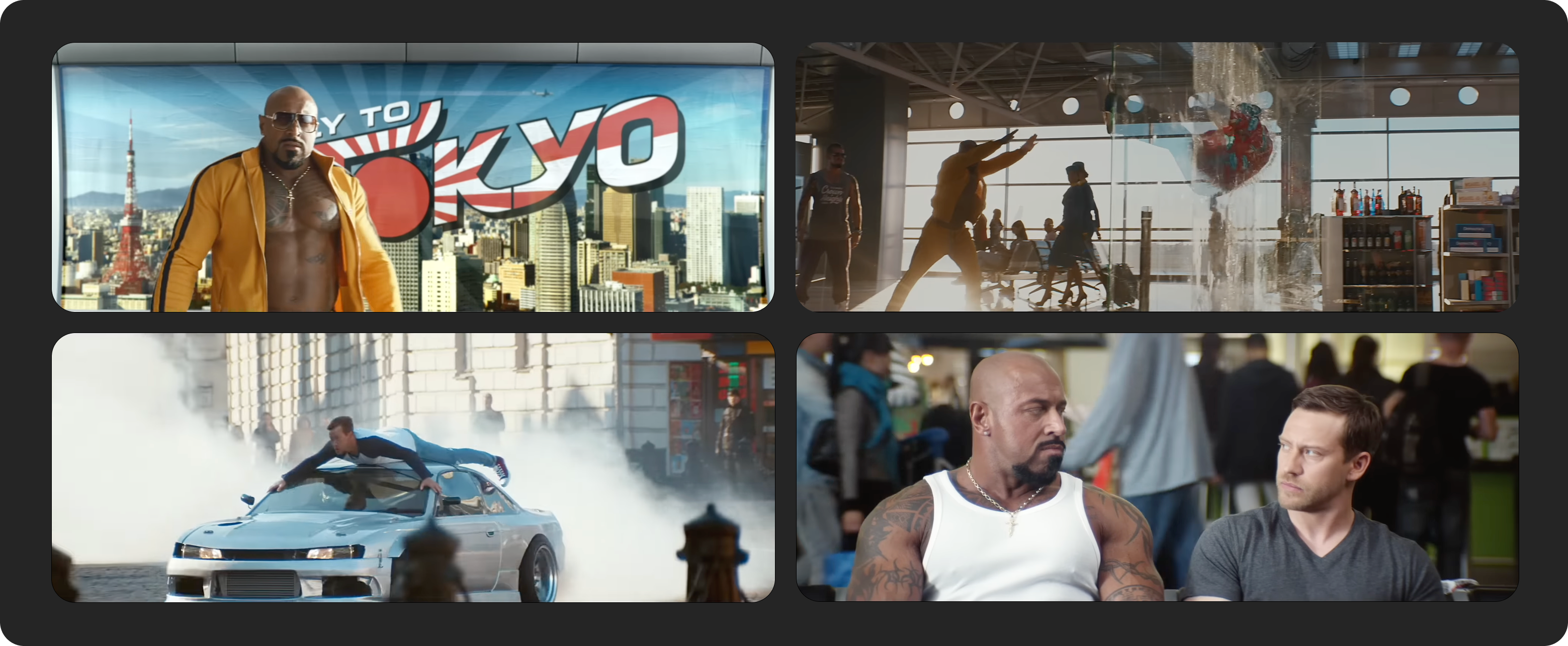
Shots from the Cheapflights TV ad I helped create
Outcomes
The new identity launched alongside an award-winning marketing campaign.
The results demonstrated that the work had strengthened both customer engagement and commercial performance.
- Average direct traffic increased by 120%
- Traffic remained 122% year-on-year several months after launch
- The mobile app reached 3 million users, doubling its user base within six months
Perhaps more importantly, the organisation now had a shared design language that product, engineering and marketing teams could build upon for years afterwards.
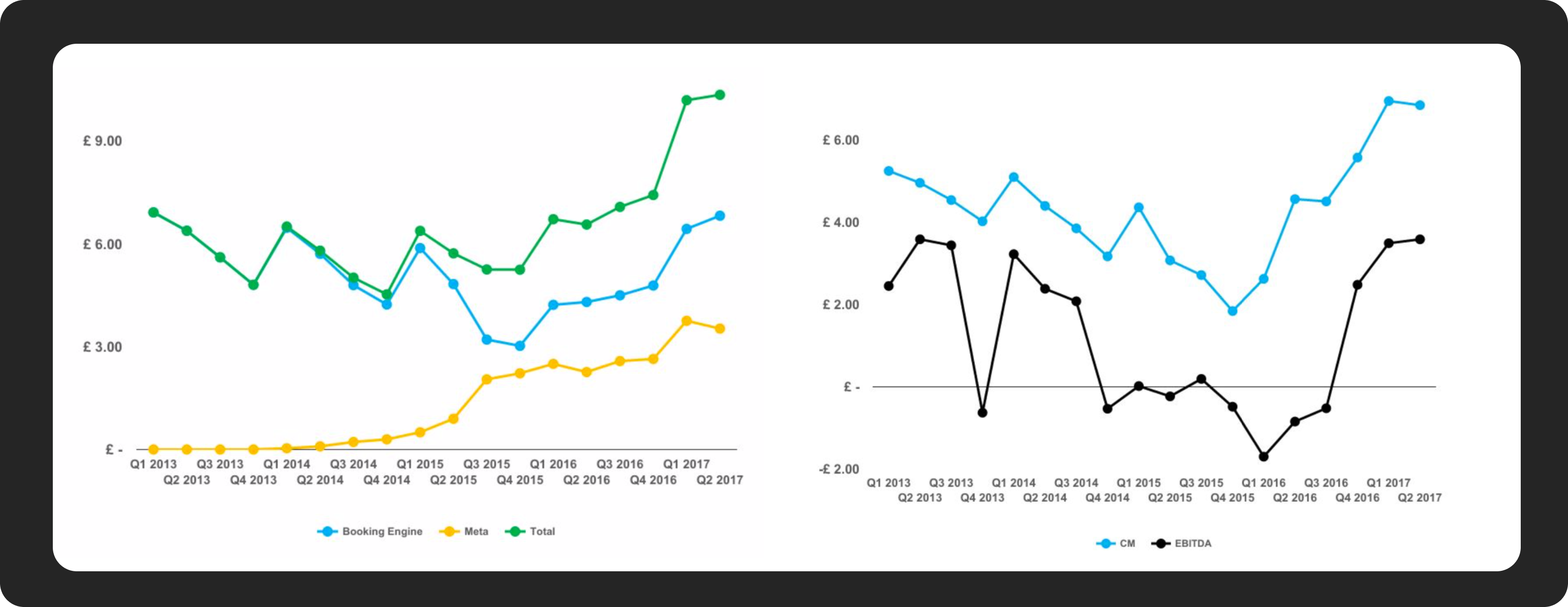
Showing the impact of the rebrand and new product offerings on revenue and profit
Reflection
A brand isn’t a logo or a marketing campaign. It’s the operating system that shapes every customer interaction.
The most valuable outcome wasn’t the visual identity itself. It was creating enough clarity that hundreds of product, design and marketing decisions could be made consistently without needing central approval.